|
Data Graphics
Design Patterns
Example
Color Schemes
Related Work
EOS End of the Rainbow
Articles
|
|
Design Patterns for Data Graphics
The design patterns concept was first made explicit by architect
Christopher Alexander in two books: A
Pattern Language and The
Timeless Way of Building. Design
Patterns by Erich Gamma, Richard Helm, Ralph Johnson, and John Vlissides
introduced design patterns to the field of software engineering where they
have been much studied.
The form of design patterns takes advantage of the natural tendency of
expert designers to think in problem-solution pairs. According to Alexander,
"each pattern is a three-part rule, which expresses
a relation between a certain context, a problem, and a solution."
Designing data graphics may be viewed as a task of user-interface design,
and the design patterns for data graphics presented here overlap with
pattern collections for user-interface design and data visualization. Among
these collections are Jenifer Tidwell's UI
Patterns and Techniques, Martijn van Welie's Web
Design patterns, and recently published books on The
Design of Sites, and A
Pattern Language for Web Usability.
Barry Wilkins has written his
doctoral
dissertation on Visualization
Patterns.
This site presents five new design patterns:
|
Title
|
Diverging color scheme
|
|
Headline
|
Display diverging data using two complementary
color schemes that diverge from a common hue.
|
|
Illustration
|
|
|
Context
|
Many data distributions include a midpoint critical
value where both ends of the data distribution are of interest. The
midpoint critical value “…may be a mean, median, or zero value…”
and the reader “…is often interested in patterns in the data that show
clusters both above and below the critical value.” [Brewer, 1996,
p. 79] Examples of diverging data distributions include anomalies and
residuals.
|
|
Problem
|
|
|
Solution
|
Align perceptual orderings with logical orderings
by displaying diverging data using a diverging (double-ended) color
scheme. Craft color schemes using intensity to indicate magnitude and hue
to indicate sign. In cases where the magnitude is relevant but the sign is
not, consider using a more parsimonious grayscale intensity scheme. The
combination of various pairs of single-hue sequential schemes with common
endpoints produces many useful diverging schemes.
|
|
Forces
|
|
|
Implementation
|
Choosing an appropriate color scheme for diverging
data need not be a difficult or complicated process. For some variables
convention suggests the color scheme. Air temperature, for example, is
often displayed using a diverging scale of red and blue with zero on the
Celsius scale marking the transition. Cartographers have traditionally
displayed surface elevation using a scheme of browns or greens and ocean
depth using progressively darker blues. Brewer [1996] suggests the
following hue combinations for diverging schemes: red/blue, orange/blue,
orange/purple, yellow/purple, brown/blue, and yellow/blue.
|
|
Examples
|
|
|
Related Patterns
|
Consider using histogram to balance the data
distribution with the color scheme (and also for display)
For data without a mid-point critical value, see
sequential color scheme.
|
|
Title
|
Sequential color scheme
|
|
Headline
|
Display data that do not contain midpoint
critical values using sequential color schemes
|
|
Illustration
|
|
|
Context
|
Many data distributions include a range of values
without a significant midpoint. Absolute critical values may bound such
distributions, as in the case of percentages, or the range of sampled data
may arbitrarily define the endpoints, but there is no significant central
value within the range of the data.
|
|
Problem
|
Spectral color schemes work poorly for sequential
data, because spectral order produces no natural magnitude message in the
viewer’s mind.
|
|
Solution
|
Display sequential data using a sequence of
lightness steps combined with a single hue (e.g., Figure 1a) or with a hue
transition.
|
|
Forces
|
|
|
Implementation
|
Beware that a hue transition may exhibit some of the
characteristics of a diverging color scale. In particular, when yellow is
employed as the hue, saturated yellow will tend to stand out from
transitional hues that are darker.
|
|
Examples
|
|
|
Related Patterns
|
|
|
Title
|
Resolution indicates data quality
|
|
Headline
|
Displays with higher resolution than the underlying
data can mislead the viewer
|
|
Illustration
|
|
|
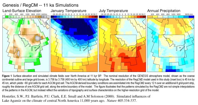
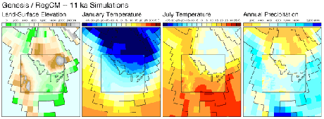
Context
|
Array-oriented data typically represent phenomena
measured, modeled, or recorded at a specific resolution, and often
displayed as pixels or cells in a regular grid.
|
|
Problem
|
Interpolation and contouring algorithms smooth data
by definition, but scale of measurement is an important characteristic of
data and should not be obscured. High-resolution presentation of the data,
or the use of high-resolution reference overlays, such as continental
outlines or political boundaries, can obscure important limitations of the
data or hide the nature of the underlying model. As an example, the viewer
may make spurious inferences about climate change in the Rocky Mountains
based on juxtaposition of a detailed United States map with the output
from a climate model, which represents the Rocky Mountains only crudely.
|
|
Solution
|
Indicate the resolution of the underlying data by
showing grid-cells and reference maps at their measured or recorded
resolution. If effective resolution varies over the map, vary the display
accordingly. Consider the array-oriented data as representing an array of
pixels and display those pixels as faithfully as possible, without
smoothing. If the array is insufficiently dense to provide a good visual
representation without smoothing pixels, consider an alternate
cartographic representation such as point symbols. The display should
clearly show null or missing values using black, white, or an appropriate
neutral color.
|
|
Forces
|
|
|
Implementation
|
|
|
Examples
|
|
|
Related Patterns
|
|
|
Title
|
Histogram-guided transformations
|
|
Headline
|
Viewing the data graphic on its own is often
insufficient to understand the interaction of a color scheme with the data
distribution.
|
|
Illustration
|
|
|
Context
|
Perceptually a color scheme is a selective
transformation of the data.
|
|
Problem
|
Viewing the map alone is often insufficient for
assessing the goodness of fit between the color scheme and the data, and
for determining whether apparent patterns in the data are true and valid
or merely display artifacts. Iteratively or interactively altering
properties of the color scheme may also reveal patterns in the underlying
data or model.
|
|
Solution
|
Use a histogram in combination with map display to
evaluate color schemes. Viewing the two in combination may suggest
appropriate mathematical transformations of the data for display.
combining the histogram with the data is also truth
in advertising. Consider displaying the histogram along with the data if
color is used selectively to accentuate certain values, features, or
patterns.
|
|
Forces
|
|
|
Implementation
|
The histogram tool employed should be able to
“ignore” missing values. “Standardized” data does not necessarily
yield a normal distribution over any given map area.
|
|
Examples
|
|
|
Related Patterns
|
|
|
Title
|
Anomalies and residuals
|
|
Headline
|
Recognizing patterns from a single image of
differences is often easier than comparing two images visually.
|
|
Illustration
|
|
|
Context
|
Exploring and highlighting patterns is a primary
purpose of scientific data graphics. Measured in absolute terms, the
variations that produce patterns are often small, but relative magnitude
may be significant.
|
|
Problem
|
Depending on the data distribution, calculated
differences between two data sets or variables (i.e., anomalies or
residuals) may prove more useful than the two data sets themselves. Three
commonly calculated differences are:
1.
Differences between two extremes, such as between July and January
temperature.
2.
Differences between the data and some measure of central tendency,
such as a mean or median value.
3.
Differences between measured data and data simulated by a model.
|
|
Solution
|
Mapping differences, in addition to or instead of
absolute quantities often helps the viewer to recognize patterns, and
allows the mapmaker to communicate more information in a smaller space.
|
|
Forces
|
|
|
Implementation
|
|
|
Examples
|
|
|
Related Patterns
|
|
Works Cited
Brewer, C.A., 1996. Guidelines for selecting colors for diverging schemes on
maps. The Cartographic Journal, 33(2): 79-86.
Brewer, C.A.,
1997. Spectral schemes: controversial color use on maps. Cartography and
Geographic Information Systems, 24(4): 203-220.
Tufte, E.R.,
1983. The Visual Display of Quantitative Information. Graphics Press, Cheshire,
Connecticut, 197 pp.
Tufte, E.R.,
1990. Envisioning Information. Graphics Press, Cheshire, Connecticut, 126 pp.
Tufte, E.R.,
1997. Visual Explanations. Graphics Press, Cheshire, CT, 156 pp.
Department of Geography, University of Oregon
last modified
02/12/2007 10:42 PM
|